

Could your website be working harder for you?
The 'Explore' interface in GA4 is very different to views we have had in previous versions of GA (although perhaps familiar to Adobe users). However, once you become used to its layout, it opens up opportunities to delve deeper into your data using dimensions and metrics that are not available in standard reports. Moreover, 'Explore' proves to be a valuable tool for troubleshooting implementation issues within the interface.

In this article, we will explore the benefits of using 'Explore' (which we'll also call Explorations) providing a step-by-step guide and valuable tips for implementation and reporting.
Here is a summary of the key difference between Explore and Standard Reports:
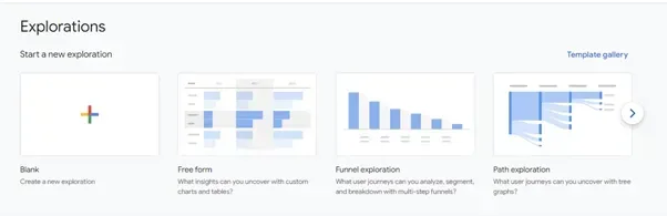
Why don't we open your 'Explore' now and give it a go? In your GA4 reporting interface, locate the 'Explore' tab on the left-side menu. You will then be presented with the following interface. To create a new Exploration from scratch, click on the 'Blank' option. Alternatively, you can choose from an existing template to get started.
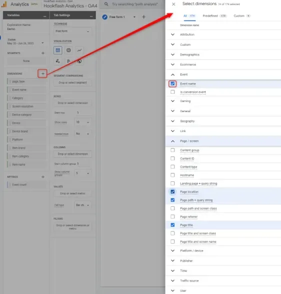
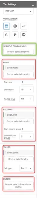
The layout of 'Explore' offers a logical process for setting up data visualizations. The first step involves deciding which dimensions and metrics will best address your questions. To import these, simply click on the ‘+’ icon to access the list of available dimensions or metrics. Select the ones you require, and then click the 'import' button located at the top right corner.
Here are a few points to highlight about custom dimensions and metrics:
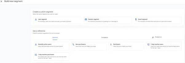
At this point, if you wish to include only the data of a particular audience group or compare data between different groups of web users or visits, you can apply segments by clicking the ‘+’ button next to the ‘SEGMENTS’ section above the DIMENSION section. This action will open a ‘Build new segment’ panel. Here, you can either choose from prebuilt segments or create your own custom definitions. Ensure that you select the correct scope for your analysis:
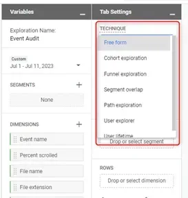
Once you've assembled your toolbox with dimensions, metrics, and segments in the ‘Variables’ panel, head over to the ‘Tab Settings’ panel to craft your data visualization. Choose from seven available techniques in GA4 Explore to present your data effectively:
To choose the appropriate reporting technique, navigate to the drop-down menu under 'TECHNIQUE.' If you are in the process of troubleshooting, post-implementation monitoring, or are just beginning to explore insights within your data, I recommend starting with the 'Free Form' technique. Additionally, I've utilized the 'User Explorer' technique, employing a testing client ID to troubleshoot issues related to traffic source persistency.
In this section, we will demonstrate two visualisation techniques: ‘Free form’ table and ‘Funnel exploration’. We will include the other techniques and their use cases in our upcoming articles of this comprehensive guide series.
The 'Free Form' technique stands as one of the most widely employed methods due to its versatility and effectiveness. Within this approach, you can choose from six visualization forms: table, donut chart, line chart, scatterplot, bar chart, and geo map. Each form requires different input based on the nature of the visualization format. For instance, when creating a table, you should consider which dimensions you want to use as rows and columns, and what metric you want the table to report on. You can also just quickly pull up numbers without any columns.
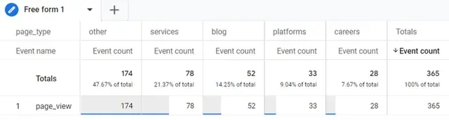
To demonstrate, on Hookflash’s website, we grouped our content using the 'page_type' custom dimension. We aimed to create a table showing the number of visits for each page type, with 'page_type' as columns and 'page_view' as rows. Both dimensions were imported following Step 1: 'page_type' as a custom dimension passed with the 'page_view' event and 'Event name' as a built-in GA4 dimension.
Additionally, we imported 'Event count' as the metric to track event counts. To add these fields correctly, you can drag and drop them from the variables panel to the tab setting panel or use the 'Drop or select metric' tile and choose from the menu.
To set up the filter for precisely matching 'page_view' events (page visits), scroll to the bottom of the tab settings and select 'page_view' as the dimension. Choose 'exact match' and input the value 'page_view.' You'll find other matching options like 'contains,' 'begins with,' 'ends with,' 'matches regex,' and their negative counterparts.
You can also apply the segment you created in Step 2 by dropping or selecting it under the 'SEGMENT COMPARISONS' section, right below the 'VISUALIZATION' selections.
This set up gives us exactly what we want:
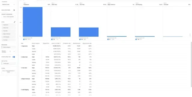
Funnel exploration enables you to define step-by-step user journeys based on your own rules. It's a powerful tool for analyzing churn and conversion rates. For instance, you can create an ecommerce funnel using GA4 ecommerce events.
To begin configuring each step, click on the pencil icon beside 'STEPS.' Provide a sensible and precise title for each step in the 'New Step' input field. Next, click on 'Add new condition' to select an event or other dimensions. For more precise conditions, consider adding parameters. Each step can have multiple conditions with ‘OR’ logic, allowing for a high level of precision. Keep adding steps by clicking on 'Add step' to further fine-tune your analysis.
To summarise the other options when setting up funnel exploration:
Here's an example of a standard ecommerce funnel comparing by device category, with elapse time activated.
Don’t forget to give your Explore a sensible name and define the time range under the ‘Variables’ panel.
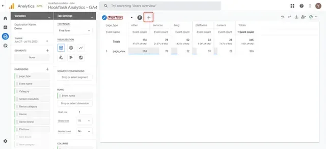
You can also add multiple visualizations within the same Explore; simply create multiple tabs by clicking on the '+' on top of the Explore output view. You can give each tab a name by clicking on the tab title and typing the desired name.
If you're ready to publish this Explore for other users with access to the property to view the output, click on the icon next to the download button (below). Keep in mind that other users will have view-only access and will need to make a copy to edit a duplicated version of this Explore.
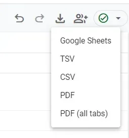
Finally, you can also download the output by clicking the download icon. You have the option to export to the following file types:
As the name suggests, GA4 Exploration is your go-to tool for delving into your data during the exploration stage. At Hookflash, we've also found Explore to be invaluable for troubleshooting and ensuring data quality. There are some limits (as below) but we they're pretty generous!
Make sure you plan your analysis by taking the time to decide the dimensions, metrics, and segments you need for relevant insights. Then choose how to present the data. And remember, you can include different visualizations by adding multiple tabs.
If you ever need guidance or support, don't hesitate to reach out. We're here to help you make the most of GA4 Exploration!

